ySelectionPicker
Description
The ySelectionPicker is a UI component designed for creating selectable lists in web applications. It provides a user-friendly interface for selecting one or more items from a given set of options. The ySelectionPicker can, for example, be used for:
Basic Structure
The basic structure of the ySelectionPicker shall be explained in the following. For the general structure of a yComponent please visit the YBase-components basic-structure.
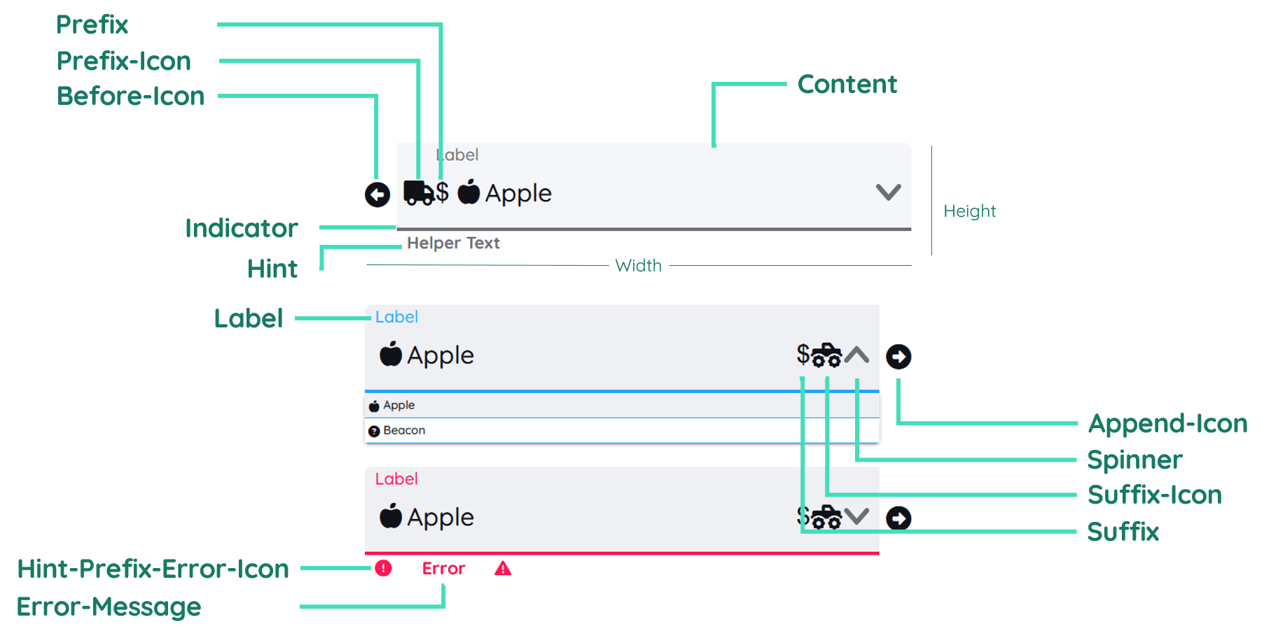
The ySelectionPicker as seen above contains a label and a helper text and includes multiple icons and more.
Label
The label contains the text inside the ySelectionPicker. It is on the left side of the component. It will get moved to the top, when a selection is document. The label can be clicked to trigger a Selection to make the selection list visible. You can find further explanation at the Label Property.
Helper Text
The Helper Text is similar to the label and displays a hint related to the input that will be expected. In certain situations the helper text will be replaced by a warning or error text, which can either be set through the automatic validation or custom scripts.
Spinner Icon
The spinner icon can also be used to make a selection and make the selection list visible. It is on the right side of the ySelectionPicker.
Properties
Through its various properties the ySelectionPicker can be configured to suit your needs. The display below provides you with an overview of all the ySelectionPicker properties.
Properties can be changed directly through three methods:
- Inside the Toolbar, which is positioned in your workarea next to your component right where you need it. It shows the most important properties, thus providing a fast and efficient way to configure your component in the most basic way.
- It may also occur in the Toolbar Extension, which is a seamless extension accesible as a dropdown item of the Toolbar. It extends the functionality of the Toolbar by providing advanced pickers for the most used properties.
- Inside the Detail Panel, which is located in the righthand drawer. Every property of a component can be configured here.
- Generic
- Style
- SelectionPicker
- Links
- Events
METAread more
The identifier of the component that is unique within a page.
The type of the component. For this component it is -selection-picker.
The custom name of the component. It serves for better identification of the component.
The custom version of the SelectionPicker-component. This can be used to ensure that all components work well together.
The CoreTheme, which will be apllied to the SelectionPicker. For further information on themes visit the themes page.
The subtheme subordinated to the previously specified CoreTheme, which will be apllied to the SelectionPicker. For further information on themes visit the themes page.
The group theme is a further variation of the subtheme which is specified especially for variations of a component inside the subtheme. For further information on themes visit the Theme-Manager page.
DISPLAYread more
This property specifies the display behavior of the component. This can be be set to:
- none
- block
- flex
- inline
This property specifies the type of positioning method used for the component. This can be be set to:
- static
- relative
- absolute
- sticky
- fixed
This property can toggle the visibility of the component. The two modes are completely hidden and fully shown.
SIZEread more
The minimum value for the width of the component. This can be set in:
- px
- pt
- em
- vw
- vh
- %
The minimum value for the height of the component. This can be set in:
- px
- pt
- em
- vw
- vh
- %
The value for the width of the component. This can be set in:
- px
- pt
- em
- vw
- vh
- %
- auto
The value for the height of the component. This can be set in:
- px
- pt
- em
- vw
- vh
- %
- auto
The maximum value for the width of the component. This can be set in:
- px
- pt
- em
- vw
- vh
- %
- none
The maximum value for the height of the component. This can be set in:
- px
- pt
- em
- vw
- vh
- %
- none
The flex property sets the length on flexible items. This sets the value in n-fold shares extrapolated to all other components with the flex display within the same container.
PLACEMENTread more
This property creates a space around the component, outside of the top border. This can be set in percent or pixels.
This property creates a space around the component, outside of the right border. This can be set in percent or pixels.
This property creates a space around the component, outside of the bottom border. This can be set in percent or pixels.
This property creates a space around the component, outside of the left border. This can be set in percent or pixels.
This property creates a space within the component, inside of the top border. This can be set in percent or pixels.
This property creates a space within the component, inside of the right border. This can be set in percent or pixels.
This property creates a space within the component, inside of the bottom border. This can be set in percent or pixels.
This property creates a space within the component, inside of the top border. This can be set in percent or pixels.
BACKGROUNDread more
The color of the background. This can be set as a color from a palette or a custom hex color.
BORDERread more
The color of the top border. This can be set as a color from a palette or a custom hex color.
The style of the top border. This can be be set to:
- solid
- dotted
- dashed
- none
The width of the top border. This can be set in percent or pixels.
The color of the right border. This can be set as a color from a palette or a custom hex color.
The style of the right border. This can be be set to:
- solid
- dotted
- dashed
- none
The width of the right border. This can be set in percent or pixels.
The color of the bottom border. This can be set as a color from a palette or a custom hex color.
The style of the bottom border. This can be be set to:
- solid
- dotted
- dashed
- none
The width of the bottom border. This can be set in percent or pixels.
The color of the left border. This can be set as a color from a palette or a custom hex color.
The style of the left border. This can be be set to:
- solid
- dotted
- dashed
- none
The width of the left border. This can be set in percent or pixels.
The radius of the corners of all the borders. This can be set in percent or pixels.
SHADOWread more
The shadow of the component. This is set by the 4 sub-properties x, y, blur and spread of the shadow-property, which can be further read about in the shadow-property section.
OPACITYread more
The opacity of all colored parts of the component. This value is set in percent.
LABELread more
The color of the label text. This can be set as a color from a palette or a custom hex color.
The font-family of the label text. This can be picked from a large list of provided fonts.
The font-weight of the label text. This can be set in a custom number, as example:
- 400 = normal(regular)
- 500 = medium
- 600 = semi bold
- 700 = bold
The font-style of the label text. This can be set to normal, italic or oblique.
The text-transformation of the label text. This can be set to:
- capitalize
- uppercase
- lowercase
- none
- full-width
The text-decoration of the label text. This can be set to:
- strikethrough
- underline
The font-size of the label text. This can be set in: -cm
- mm
- in
- px
- em
- ex
- ch
- rem
The actual written text in the label. There is no limit to the number of characters.
CONTENTread more
The color of the content background. This can be set as a color from a palette or a custom hex color.
The font-color of the text-content inside the SelectionPicker-component.
The font-family of the text-content inside the SelectionPicker-component.
The font-weight of the text-content inside the SelectionPicker-component.
The font-style of the text-content inside the SelectionPicker-component.
The text-transformation of the content text. This can be set to:
- capitalize
- uppercase
- lowercase
- none
- full-width
The text-decoration of the content text. This can be set to:
- strikethrough
- underline
The font-size of the text-content inside the SelectionPicker-component.
The font-align of the content text. This property moves the content text to the desired position, it can be set to left, center or right.
This property creates a space within the component, inside of the left and right border. This can be set in percent or pixels.
This property creates a space around the content of the SelectionPicker-component, outside of the bottom border. This can be set in percent or pixels.
The content to be displayed inside the SelectionPicker-component.
This property specifies if multiple values should be allowed.
This property specifies if multiple selections are to be allowed.
This property specifies if buttons should be allowed.
This property specifies if the icon should be shown instead of the label.
This property specifies if selection by the user should be allowed or not.
This property specifies if custom regex expressions should be allowed or not.
This property specifies if the value should be shown instead of the label.
HINTread more
The color of the hint text. This can be set as a color from a palette or a custom hex color.
The font-family of the hint text. This can be picked from a large list of provided fonts.
The font-weight of the hint text. This can be set in a custom number, as example:
- 400 = normal(regular)
- 500 = medium
- 600 = semi bold
- 700 = bold
The font-style of the font-style text. This can be set to normal, italic or oblique.
The text-transformation of the hint text. This can be set to:
- capitalize
- uppercase
- lowercase
- none
- full-width
The text-decoration of the hint text. This can be set to:
- strikethrough
- underline
The font-size of the hint text. This can be set in: -cm
- mm
- in
- px
- em
- ex
- ch
- rem
The font-align of the hint text. This property moves the hint text to the desired position, it can be set to left, center or right.
The icon to be shown for the prefix of the hint text.
The icon to be shown for the suffix of the hint text.
The hint that is going to be displayed.
PREFIXSUFFIXread more
The color of the prefix and suffix text. This can be set as a color from a palette or a custom hex color.
The color of the icon inside the prefix and suffix text. This can be set as a color from a palette or a custom hex color.
The font-size of the prefix and suffix text. This can be set in: -cm
- mm
- in
- px
- em
- ex
- ch
- rem
The icon to be shown before the SelectionPicker's input-field.
The icon to be shown behind the SelectionPicker's input-field.
The icon to be shown for the prefix of the SelectionPicker's input-text.
The icon to be shown for the suffix of the SelectionPicker's input-text.
The string to be displayed in front of the SelectionPicker's value.
The string to be displayed behind the SelectionPicker's value.
SPINNERread more
The color of the spinner background. This can be set as a color from a palette or a custom hex color.
The color of the icon inside the spinner. This can be set as a color from a palette or a custom hex color.
INDICATORread more
The color of the indicator. This can be set as a color from a palette or a custom hex color.
The height of the indicator. This can be set in:
- px
- pt
- em
- vw
- vh
- %
- auto
LISTread more
The color of the list background. This can be set as a color from a palette or a custom hex color.
The color of the list text. This can be set as a color from a palette or a custom hex color.
The font-family of the list text. This can be picked from a large list of provided fonts.
The font-weight of the list text. This can be set in a custom number, as example:
- 400 = normal(regular)
- 500 = medium
- 600 = semi bold
- 700 = bold
The font-size of the list text. This can be set in: -cm
- mm
- in
- px
- em
- ex
- ch
- rem
The font-style of the list text. This can be set to normal, italic or oblique.
The text-transformation of the list text. This can be set to:
- capitalize
- uppercase
- lowercase
- none
- full-width
The font-align of the list text. This property moves the list text to the desired position, it can be set to left, center or right.
The size of the list's icon. This can be set in: -cm
- mm
- in
- px
The color of the list indicator. This can be set as a color from a palette or a custom hex color.
The style of the list indicator. This can be be set to:
- solid
- dotted
- dashed
- none
The height of the list indicator. This can be set in:
- px
- pt
- em
- vw
- vh
- %
- auto
This property contains a list of all the options that are configured for the list.
STATEread more
This property can disable or enable the disabled-state of the SelectionPicker-component.
This property can disable or enable the error-state of the SelectionPicker-component.
This property can disable or enable the readonly-state of the SelectionPicker-component.
ERRORread more
The message to be displayed, if an error occurs.
MISCread more
This option will specify if the restriction for content should be dense or not.
This property specifies if a deselection is possible, by clicking again.
LABELread more
This property defines a link to another component by specifying the componentId or componentName, Page, Component, ID, Event. The data from the link will represent the label to be displayed.
CONTENTread more
This property defines a link to another component by specifying the componentId or componentName, Page, Component, ID, Event. The data from the link will represent the content-text to be displayed.
HINTread more
This property defines a link to another component by specifying the componentId or componentName, Page, Component, ID, Event. The data from the link will represent the hint-text to be displayed.
Usage
In this section you will find a collection of application scenarios and examples that illustrate how to leverage the ySelectionPicker in ways that deviate from its standard behavior, as defined by yBase. This section aims to inspire and guide you through various possibilities, helping you to implement more complex or unique functionalities tailored to your specific needs. General properties that are universally applicable can be found in the yBase usage section.
Variations
- Elevated
- Flat
- Outlined
- Rounded
- Plain
Special Variations
- MultiSelect
- With Search
- Icon Only
Options can include clearable selections, multi-select capabilities, and a search function. You can also have configurations with no label or hint text for a minimalistic approach.
Validation
The ySelectionPicker includes an error state that can be used to display validation messages. The validation has to be done manually via JavaScript.
// enabled async function
// async function onSelectionPicker_2_EvtListSelect (apiObject, component, eventData) {

const selectedProduct = eventData.data;
const isOnStock = testIfProductIsInStock(eventData.data); //own global function you need to create

if (!isOnStock) {
  // Display validation error message
  component.set("component", "state", "error", true);
  component.set(
    "component",
    "error",
    "errorMessage",
    "Please enter a valid search term."
  );
} else {
  // Clear error message
  component.set("component", "state", "error", false);
}
//}
OptionList
You can set the list of selectable options using the Option-List property which can be found in Style > List group. There, you can add entries and give them a unique value, a label and a tooltip.
How to:
- Open the Detail Panel and navigate to Style, unfold List, where you can find the
Option-List. - The proceed to navigate to Events, unfold Input and edit
EvtListSelect. - Insert the snippet down below.
Payment Selection
This simple example shows a specific scenario for a common use-case.
How to:
- Create a yButton.
- Select your ySelectionPicker again.
- Open the Detail Panel and navigate to Events, unfold Input, where you can find the
EvtListSelect. - Insert the code snippet down below.
Code example:
This code snippet disables the Proceed button when no valid payment method is selected and enables it as soon as the user chooses a valid one.
// function onSelectionPicker_2_EvtListSelect (apiObject, component, eventData)
const selectedValue = eventData.data[0].value;
const proceedButton = apiObject.ui.getObject(3, "y-button", "y-page", 1); // Replace with actual ID
const validPaymentMethods = ["creditCard", "paypal", "bankTransfer"];

if (validPaymentMethods.includes(selectedValue)) {
  // Enable the proceed button if a valid payment method is selected
  proceedButton.set("component", "state", "disabled", false);
  console.log("Valid payment method selected:", selectedValue);
} else {
  // Keep the proceed button disabled if the selection is not valid
  proceedButton.set("component", "state", "disabled", true);
  console.error("Invalid payment method selected:", selectedValue);
}
// }
User Role Selection
This example displays another example based on a ySelectionPicker with a custom list.
How to:
- Create a yContainer with additional children elements and modify Generic > Display >
visibleand set it tohidden. - Select your ySelectionPicker again.
- Open the Detail Panel and navigate to Events, unfold Input, where you can find the
EvtListSelect. - Insert the code snippet down below.
Code example:
This code snippet toggles the visibility of an element, based on the selection of the ySelectionPicker.
// function onSelectionPicker_2_EvtListSelect (apiObject, component, eventData)
const selectedValue = eventData.data[0].value;
const additionalOptionsPanel = apiObject.ui.getObject(
  3,
  "y-container",
  "y-page",
  1
); // Replace with actual ID
const rolesWithAdditionalOptions = ["administrator", "editor"];

if (rolesWithAdditionalOptions.includes(selectedValue)) {
  // Show additional options if the selected role has extra permissions
  additionalOptionsPanel.set("generic", "display", "visible", "visible");
  console.log("Additional options displayed for role:", selectedValue);

  // You might want to fetch and display these additional options dynamically
  fetchAndDisplayAdditionalOptions(selectedValue);
} else {
  // Hide additional options if the selected role does not have extra permissions
  additionalOptionsPanel.set("generic", "display", "visible", "hidden");
  console.log("No additional options for role:", selectedValue);
}
// A mock function to fetch additional options based on the selected role
function fetchAndDisplayAdditionalOptions(role) {
  // Fetching logic here...
  console.log("Fetching additional options for role:", role);
  // Display logic here...
}
// }